
Friday, 29 November 2013
Thursday, 28 November 2013
Production Planning.
28th November- Detailed mock front covers
29th November- Detailed mock front covers
5th December- Shooting photographs (20 photographic images, used for front cover, double page
6th December- Shooting photographs spread and contents page)
12th December- Photoshop manipulation
13th December- Photoshop manipulation
19th December- Final design
20th December- DEADLINE Front Cover
Thursday, 21 November 2013
Makeup Influences.
I will use fake eyelashes on my model to make her eyes look fuller and bolder. I think this will make the image look more real too if the lashes I choose are natural looking enough.
Friday, 15 November 2013
My Audience Media Profile.
1. A4 information that profiles your audience
2. Post a video interview with a typical member of your audience

2. Post a video interview with a typical member of your audience

Thursday, 14 November 2013
Photographic Influences.

The costumes, makeup and setting for these images is something I would like to bring together and use in my piece.


I really like the abstract and fresh composition of this image. I like the fact that it is different and not seen before. I think this is a good trait to have in an image as this will make people remember and recognise it. I like the makeup in this picture, it is smokey and dark, which makes me think this person has something to hide and that they have a darker and mysterious side to them. I think the line in this image is very different. The positioning of her hand and shoulders give a very dynamic feel to this image and I would like to take this into consideration when take the photographs for my magazine.

I love how this person is positioned in a way that most people wouldn't expect in a magazine. I think this would be a better photograph to influence my double page spread image if it was a bit wider and showed more of the location as I think it would wow my audience and it wouldn't work on a front cover in my opinion as I think there would be too much going on with the text and mast head as well. I like the lighting in this photograph, I think it is very asymmetrical and highlights the abstract lines in this image. This intrigues me as I would like to make my lighting dynamic and interesting as this is.
I also like the line and positioning in this image. I like how she looks like she has an attitude on her. The way she is grabbing the heel on her shoe gives her a 'bad girl' and a 'diva' sort of feel to her. This image is sexy and smokey and I think this would be a good influence on my images as for my target audience this would be a probable look they would aspire to in later life. I think the lighting is good as the whole background is dark. This shows that she is the focus of the image and this is also what girls of my target audience would aspire to.


.jpg)


I really like the abstract and fresh composition of this image. I like the fact that it is different and not seen before. I think this is a good trait to have in an image as this will make people remember and recognise it. I like the makeup in this picture, it is smokey and dark, which makes me think this person has something to hide and that they have a darker and mysterious side to them. I think the line in this image is very different. The positioning of her hand and shoulders give a very dynamic feel to this image and I would like to take this into consideration when take the photographs for my magazine.

I love how this person is positioned in a way that most people wouldn't expect in a magazine. I think this would be a better photograph to influence my double page spread image if it was a bit wider and showed more of the location as I think it would wow my audience and it wouldn't work on a front cover in my opinion as I think there would be too much going on with the text and mast head as well. I like the lighting in this photograph, I think it is very asymmetrical and highlights the abstract lines in this image. This intrigues me as I would like to make my lighting dynamic and interesting as this is.
I also like the line and positioning in this image. I like how she looks like she has an attitude on her. The way she is grabbing the heel on her shoe gives her a 'bad girl' and a 'diva' sort of feel to her. This image is sexy and smokey and I think this would be a good influence on my images as for my target audience this would be a probable look they would aspire to in later life. I think the lighting is good as the whole background is dark. This shows that she is the focus of the image and this is also what girls of my target audience would aspire to.


Props & Locations.


I think these locations are good influences to me. I am going to take my pictures on location rather than super impose them behind the image of my model, I think this will look a lot better than doing that but I will have to ensure that I am totally happy with the image before I take it.
As with props I am going to experiment with a few to see how they look and see what looks best with what. The props will have to stay in the theme of pop music and the theme for the photographs and artist I am portraying.
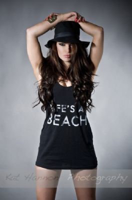
Cast.
This is Toni, she is my model for my music magazine. I have chosen her because i think I can work with her well and experiment with hair, makeup and costumes with her as I wish. I think Toni will give me the photographs and results that I would like with my music magazine.


Thursday, 7 November 2013

Wednesday, 6 November 2013
Subscribe to:
Posts (Atom)