Friday, 20 December 2013

Photographs Taken.

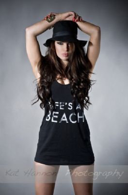
I don't like the way my model is positioned in this photograph. Her chin is very low and her head is tilted a lot which I don't like.
I don't like her facial expression on this photograph, it's like she is squinting to be able to see and also she is holding lip gloss in the photo which I wouldn't like on my front cover.


I like this photograph because she is positioned in a way where she is tilted away from the camera enough to not be full frontal but is forward enough to not be completely side on. I think the lighting frames her face very nicely and makes her cheek bones look very promenant and defined, which I like. What I don't like about it is the fact you can see her bra strap. I will have to edit this out using photoshop and make sure that in my final product you can't see it.


I took this pictures in my model's bedroom. I took them against a plain wall so that it would make editing the photographs easier and look better. I placed the lighting as well as I could so that I wouldn't produce a shadow on the wall. This is so that it is easy to crop out and won't take the emphasis off my model. I took a different range of photographs from different angles and different framings. I took them in a medium and a medium close up frame to see which I liked best. I didn't take any long shots as these pictures are meant for my front cover which is stereotypically meant to be a medium shot.
I like this photo as she looks very cool and calm. I like how she is positioned in a way that makes her look open and like a role model. I think the shadow in this picture lets it down a lot but I can edit that out in Photoshop, but apart from that this is the picture that I would like in my double page spread.


I took these pictures in my model's spare room. I positioned her in a way that was influenced by an issue of Billboard magazine. I wanted her looking relaxed and comfortable. I don't like how the flooring is carpet as I would prefer it if it was wooden or laminate but I can change this in photoshop. Also the lighting was very hard to position as it was fixed onto the ceiling in this room so I will have to make sure I edit out all of the shadows in photoshop also. I took long and wide shots of my model. I wanted the background in the picture to actually be the background in the article too. I did this because of the influence I saw in Billboard where the whole double page spread was one image.
I don't like my model's stance and body language in this photograph. She looks like she is screaming which isn't really a look I would like to portray to my target audience. I would like a photograph that is more cool and relaxed so that it intrigues people to read the article in my magazine. Also the shadow is really big in this picture which means it would be harder to edit out. She doesn't give a very good vibe in this picture so I will not be using it for my contents page.


I like this picture (I have already taken the floor out) because my model is positioned in a way where she looks sassy and like she has attitude. I think this works well as having it on my contents page because she looks like the type of person my target audience would look up to. The hand-on-the-hip look really makes her stance and body language scream 'pop idol' which is what I am aiming for. The long shot really compliments this because it lets you see her body language in more depth.

I took these pictures in the same room as I took the ones for my double page spread. I would prefer if the the carpet wasn't there as this would make it look a lot better, but I can edit it out easily. I would like my model to be full frontal and in a long shot for my contents page photograph, this is why all of these photos are long shots. I think the long shot is more suited for the contents page because you can see my model's attitude within the picture which may entice readers to look at the article on her when they look at my contents page.

Thursday, 28 November 2013

Production Planning.

28th November- Detailed mock front covers
29th November- Detailed mock front covers

5th December- Shooting photographs (20 photographic images, used for front cover, double page        
6th December- Shooting photographs                      spread and contents page)

12th December- Photoshop manipulation
13th December- Photoshop manipulation

19th December- Final design
20th December- DEADLINE Front Cover

Thursday, 21 November 2013

Makeup Influences.

For my magazine makeup on my model I really want to do something that is different and abstract like the video tutorials I have put up here. I really like the way most people would be surprised if they saw makeup like this on a normal person, but if they saw on a pop star it would be totally normal. I love the glitter in the second one, I think this would really make my model's eyes pop out and make them intriguing and interesting to look at. I like the different colours in the first tutorial, I think they really make the eyes the focus of the image and make them very noticeable and striking to the audience.
I will use fake eyelashes on my model to make her eyes look fuller and bolder. I think this will make the image look more real too if the lashes I choose are natural looking enough.

Friday, 15 November 2013

My Audience Media Profile.

1. A4 information that profiles your audience
2. Post a video interview with a typical member of your audience

Thursday, 14 November 2013

Photographic Influences.

I think these photographs are good influences because they are very posey, dramatic and powerful. They're mostly all one person shots which is what I am aiming for.
The costumes, makeup and setting for these images is something I would like to bring together and use in my piece.


I really like the abstract and fresh composition of this image. I like the fact that it is different and not seen before. I think this is a good trait to have in an image as this will make people remember and recognise it. I like the makeup in this picture, it is smokey and dark, which makes me think this person has something to hide and that they have a darker and mysterious side to them. I think the line in this image is very different. The positioning of her hand and shoulders give a very dynamic feel to this image and I would like to take this into consideration when take the photographs for my magazine.


I love how this person is positioned in a way that most people wouldn't expect in a magazine. I think this would be a better photograph to influence my double page spread image if it was a bit wider and showed more of the location as I think it would wow my audience and it wouldn't work on a front cover in my opinion as I think there would be too much going on with the text and mast head as well. I like the lighting in this photograph, I think it is very asymmetrical and highlights the abstract lines in this image. This intrigues me as I would like to make my lighting dynamic and interesting as this is.


I also like the line and positioning in this image. I like how she looks like she has an attitude on her. The way she is grabbing the heel on her shoe gives her a 'bad girl' and a 'diva' sort of feel to her. This image is sexy and smokey and I think this would be a good influence on my images as for my target audience this would be a probable look they would aspire to in later life. I think the lighting is good as the whole background is dark. This shows that she is the focus of the image and this is also what girls of my target audience would aspire to.


Props & Locations.


I think these locations are good influences to me. I am going to take my pictures on location rather than super impose them behind the image of my model, I think this will look a lot better than doing that but I will have to ensure that I am totally happy with the image before I take it. 
As with props I am going to experiment with a few to see how they look and see what looks best with what. The props will have to stay in the theme of pop music and the theme for the photographs and artist I am portraying.